
Marketing Ephemera: Designing ANNE in FASHION’s Business Cards
To be ephemeral by nature traditionally means something that is not long lasting. A project I have recently designed is a new piece of marketing ephemera for ANNE in FASHION ~ business cards! Designing and printing business cards was on the list to complete before the busy fall season with upcoming meetings, workshops, conferences, and previews. Sharing the completed design project feels great!
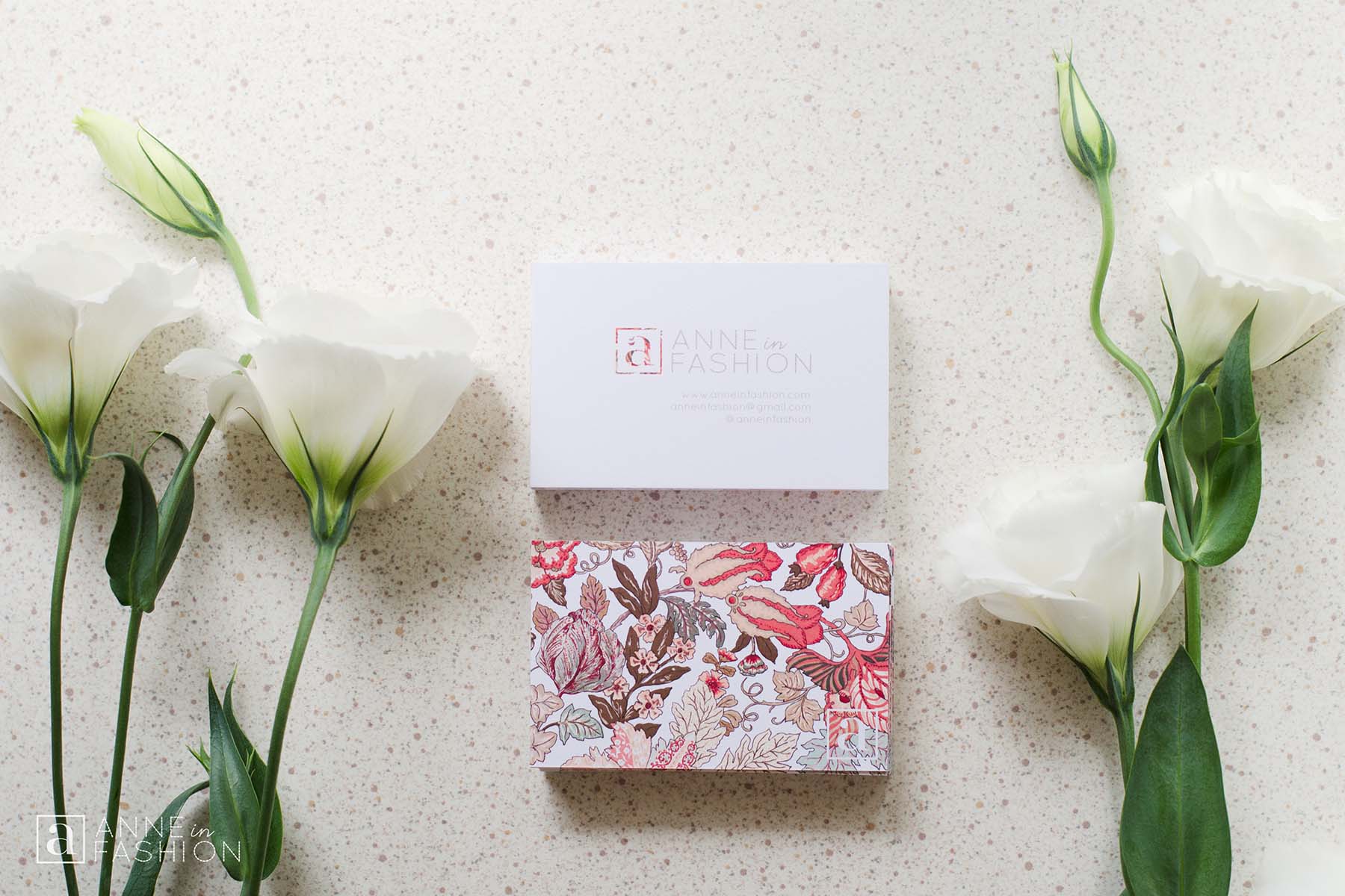
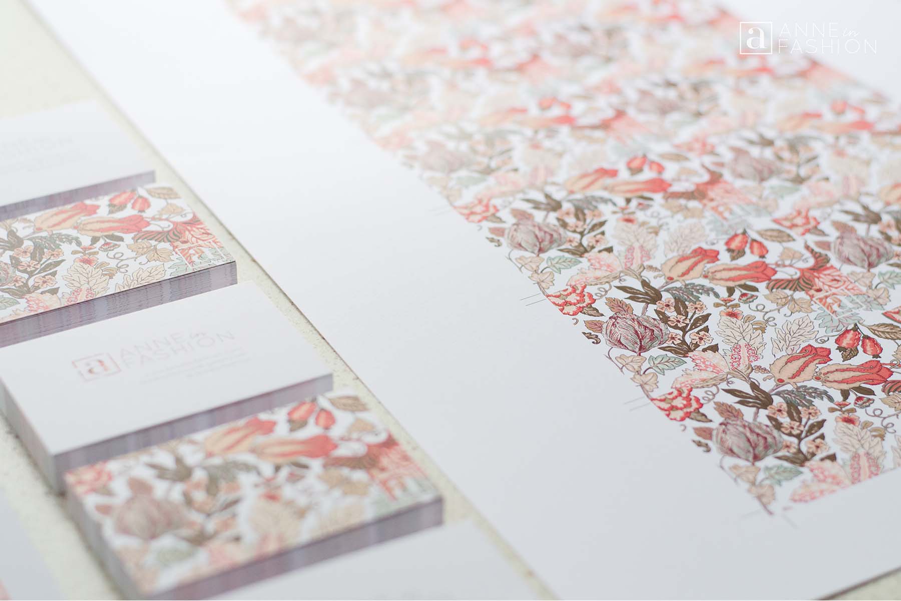
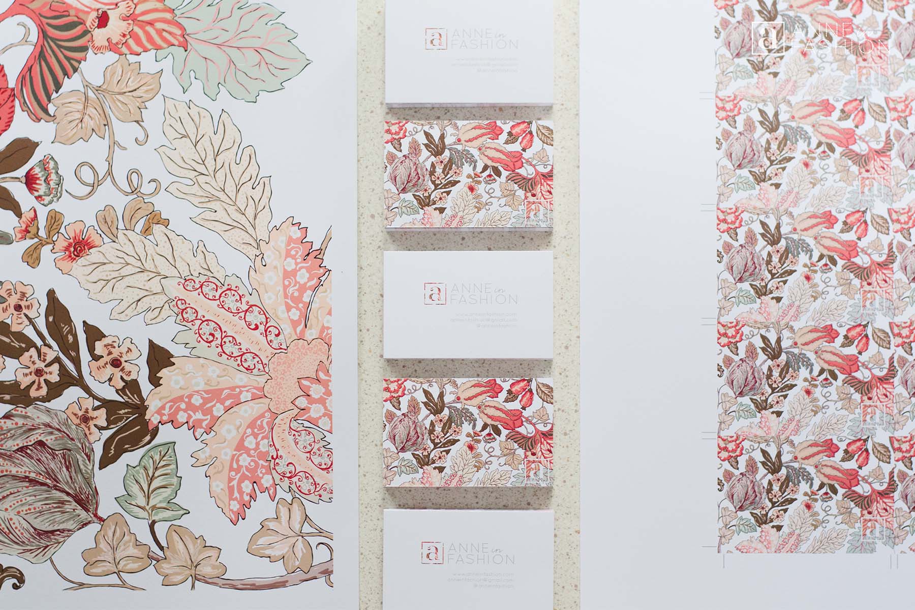
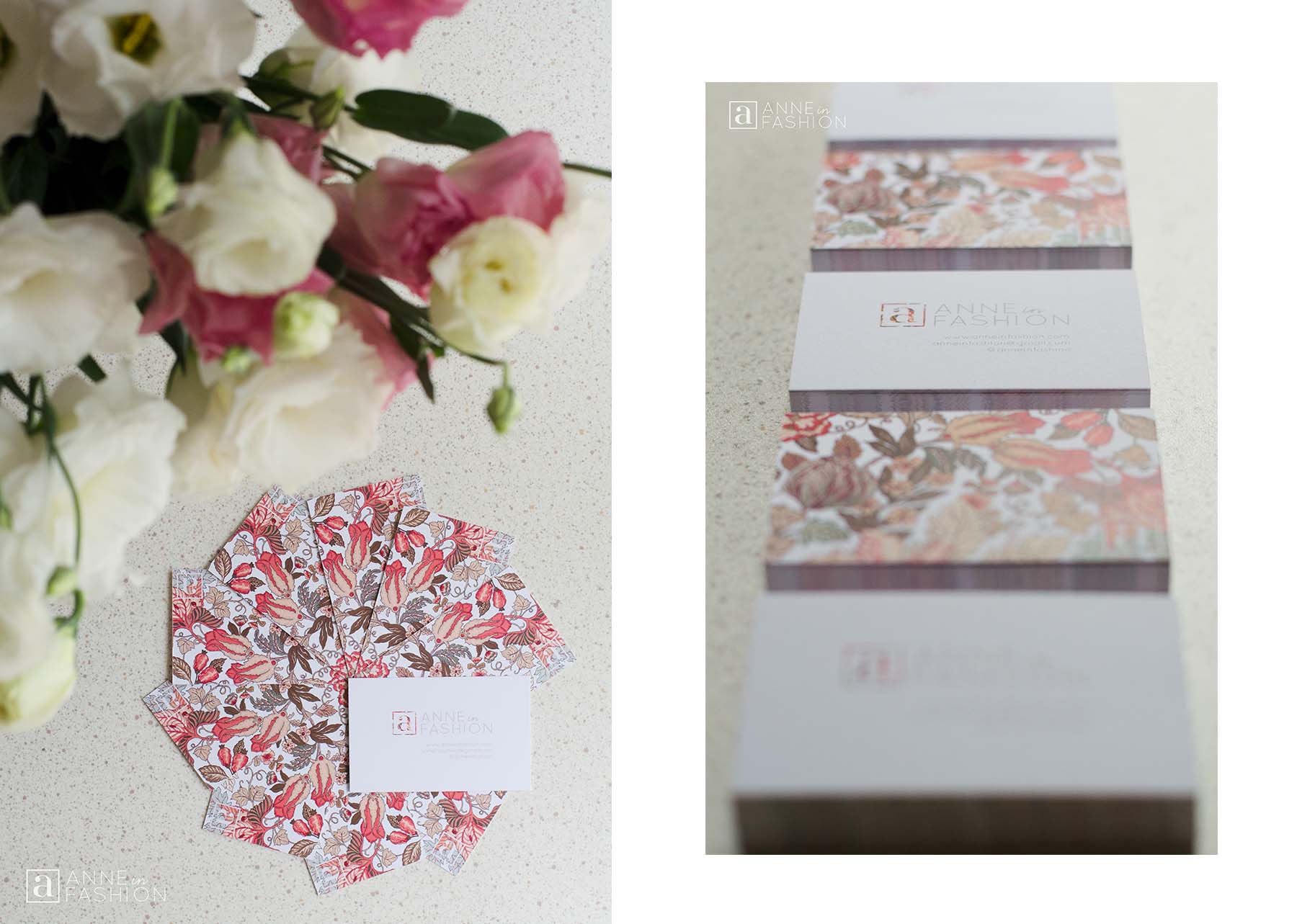
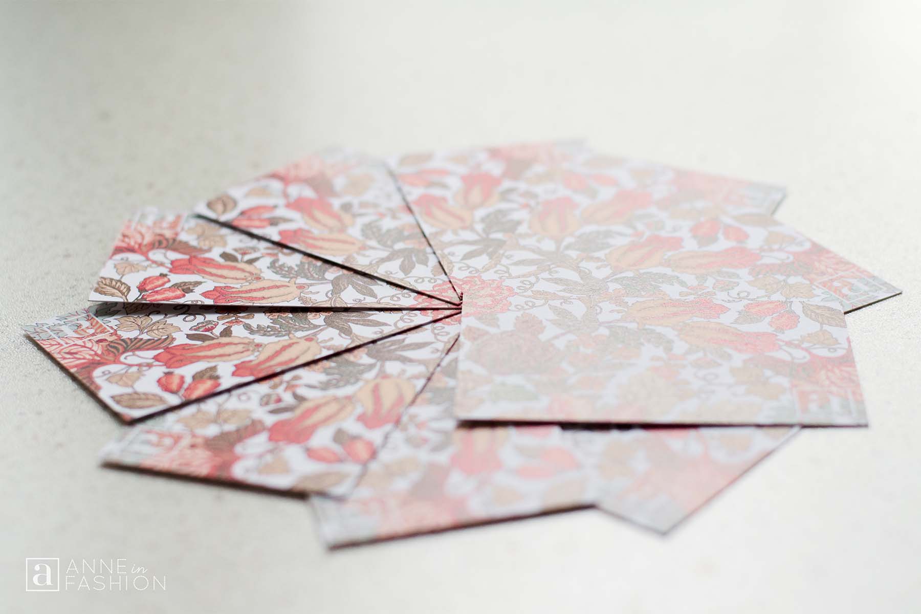
GOAL AESTHETIC: A balance of detail and simplicity is key to my brand. The contrast of the full bleed printed florals and the unprinted white space strikes the desired balance.
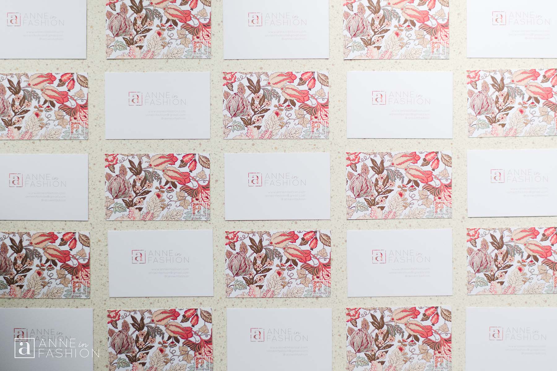
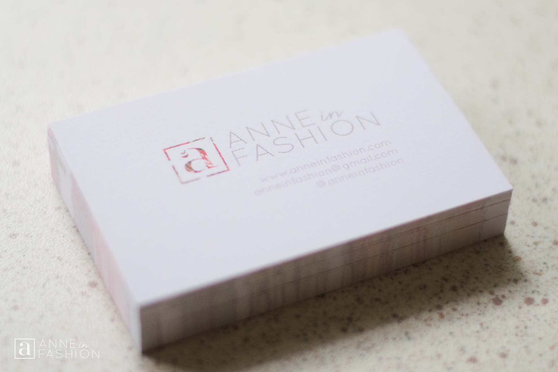
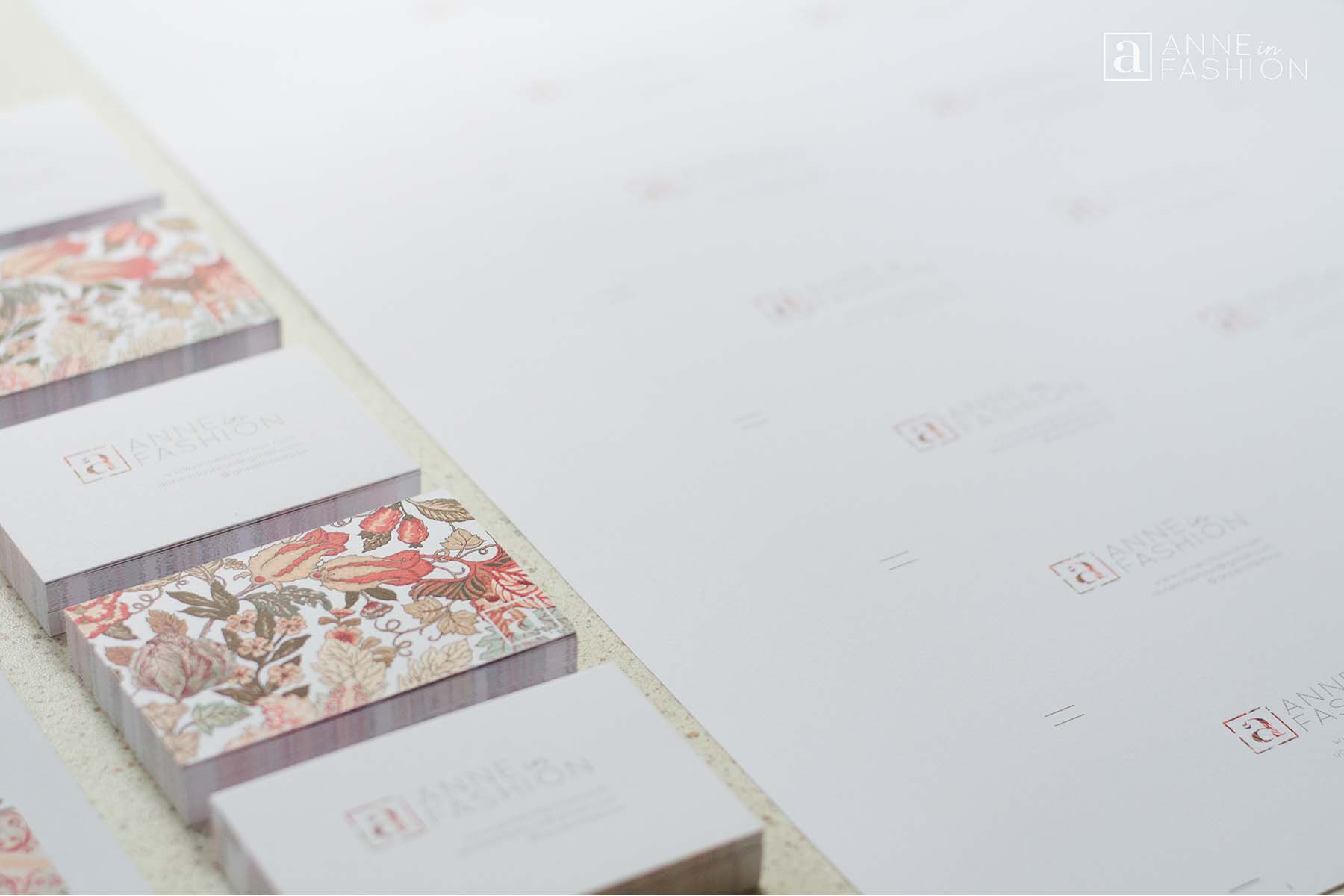
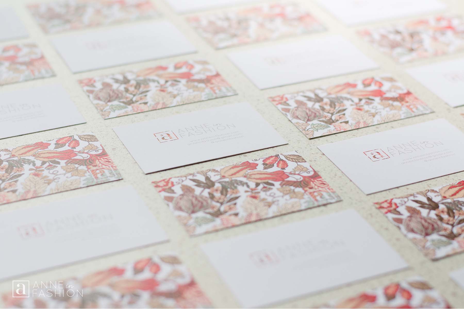
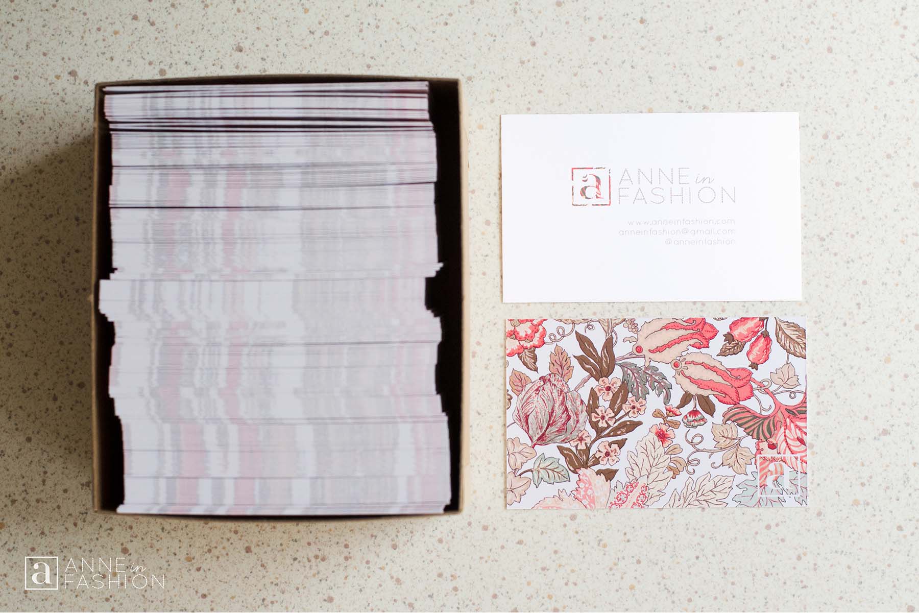
FRONT: A minimalist style approach is taken on the front of the card. The front side of the card design is kept clean and uncluttered. The patterned “a” and stitched ANNE in FASHION logo draw in the viewers’ eye. The brand elements are complimented with simple and small contact information in the brand’s suede colour. The suede colour is chosen as it is repeated in the brand’s logo and throughout the brand’s website. Right justification is used to align all of the contact information under the text portion of the logo.
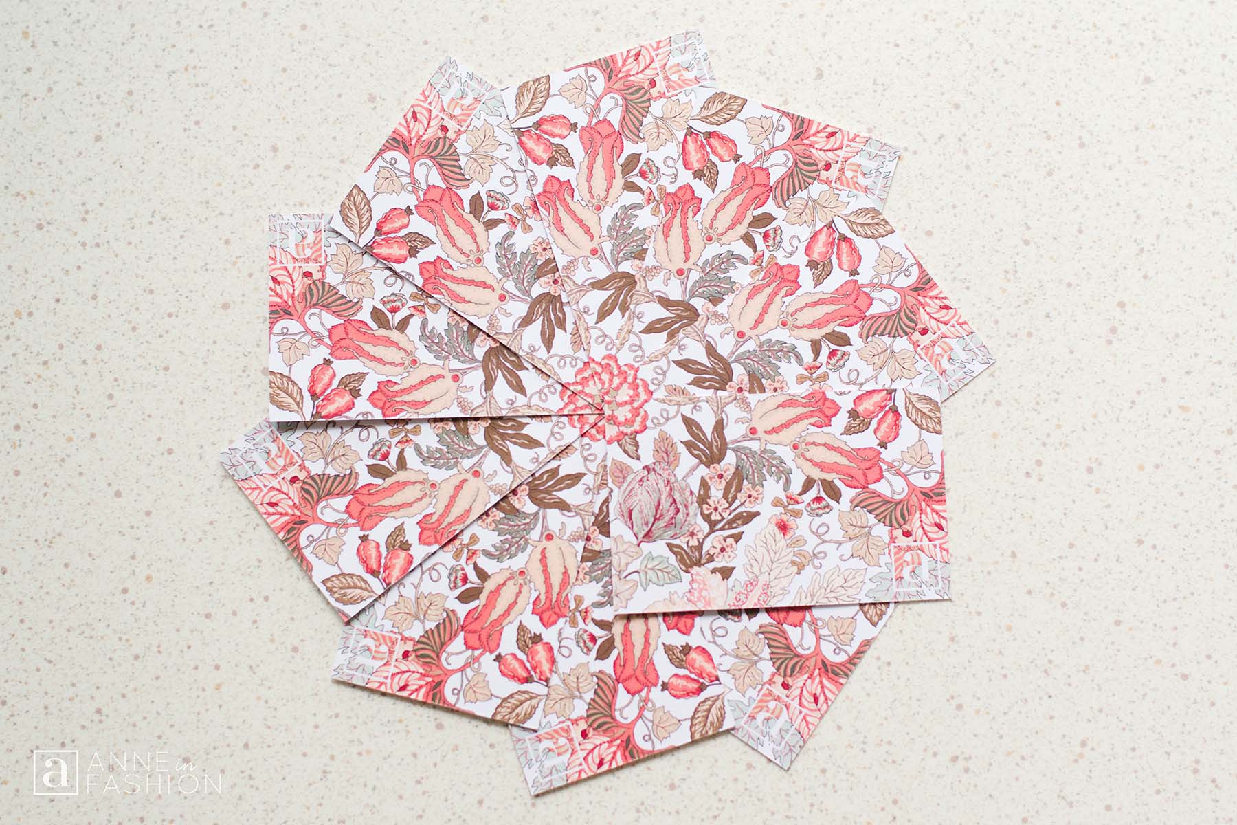
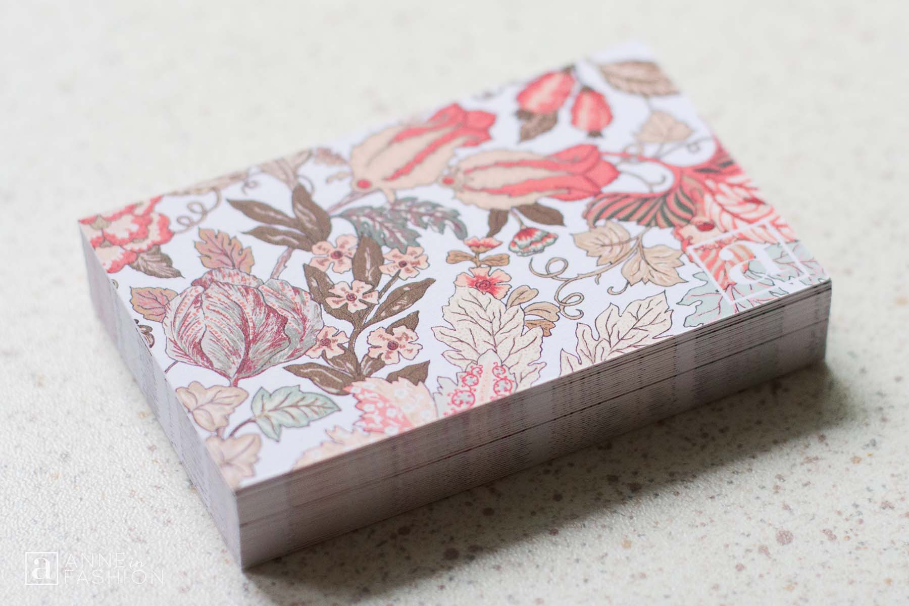
BACK: A contrast is found on the back side of the card as it is printed with my busy branded pattern. This pattern speaks to me, as it is reminiscent of some of my favourite historic English textile and wallpaper designs by William Morris and Liberty London. This colourful background decoration brings the cards to life. The “a” brand mark is marked in white in the bottom right-hand corner. This creates a cut-out effect between the front and the back sides of the cards where the pattern is used. The play of positive and negative space is a strategic design consideration.
Although I have heard of many success stories of using online print services, there is a part of me that still values shopping local. My cards were printed by a print house in my neighbourhood. The business completed my order in a single day! The printer I worked with was friendly, helpful and provided great service. I enjoyed the hands-on approach the proximity allowed. Being part of the process to approve the printed card proofs and seeing the cards printed on full sheets before being cut to size was fun. Although I love everything letterpress printed, I made simple and budget conscious choices when it came to printing these cards. I wanted the cards to be simple and casual, so the paper stock was chosen with this in mind. They are printed on 100lb matte cover paper, which for this project is the “Goldilocks” of papers – not too thick, not too thin. The paper presents the printed logo and pattern very well and it feels nice to the touch. Plus, when the finished business cards look pretty alongside Lisianthus blooms or “Prairie Tulips” I can only be happy with the outcome!
Read recent articles
Gold Jewelry Trends
Minimal Design Solutions
New Ideas 2018
If you look for a meaning, you’ll miss everything that happens.